The following video is a presentation on UX and design patterns for WebRTC applications that I had the pleasure of giving at Google’s San Francisco office in September 2015 as part of the KrankyGeek WebRTC Live conference. It was a great event with many interesting speakers, and I encourage you to check them all out. Below is a video of my talk and a written summary of the presentation. You can also see my slides on Slideshare.
The UX of WebRTC from arinsime on Vimeo.
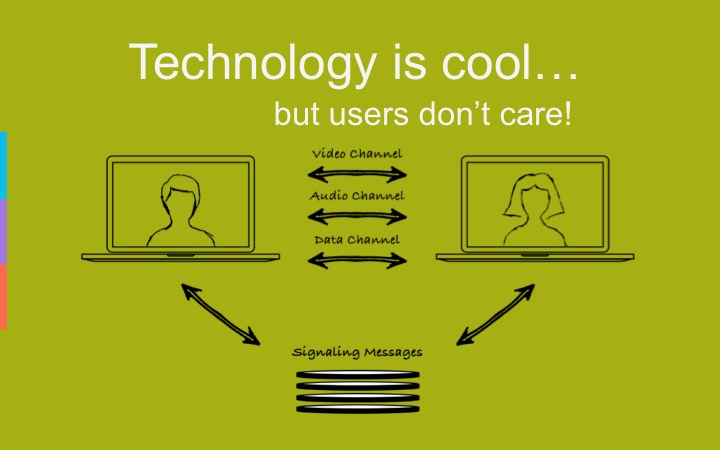
WebRTC Technology is cool … but users don’t care!
To us, WebRTC is about the technology. P2P, encrypted, STUN/TURN, Signaling, Reliable and Unreliable Data Channels … As technologists and entrepreneurs, we love this stuff! But we have to remember that the end-users of our applications don’t actually care!
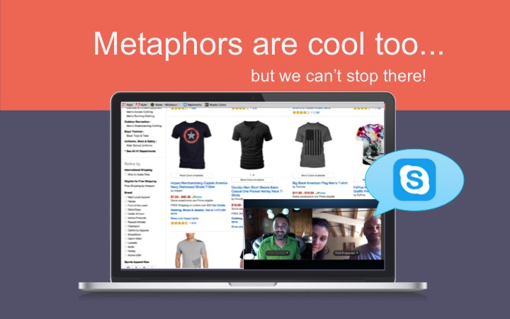
Metaphors are cool too … but we can’t stop there!
So we try to explain WebRTC using cliches, and that’s alright, but the end users still don’t care! Metaphors like “Skype in your browser” help explain the business value of WebRTC, which is incredibly important, but we still shouldn’t jump from business plans right to the technology, without thinking about the user interaction first.
Users only care about the experience
The end users care about one thing. They have a problem to solve, and hopefully we’ve already established that WebRTC is going to solve that problem. So once they are using our tool, the only thing they care about is Experience.
User Experience design is incredibly important, because without a good user experience, your great idea and cool technology will falter. So let’s talk briefly about how to make WebRTC sing visually!
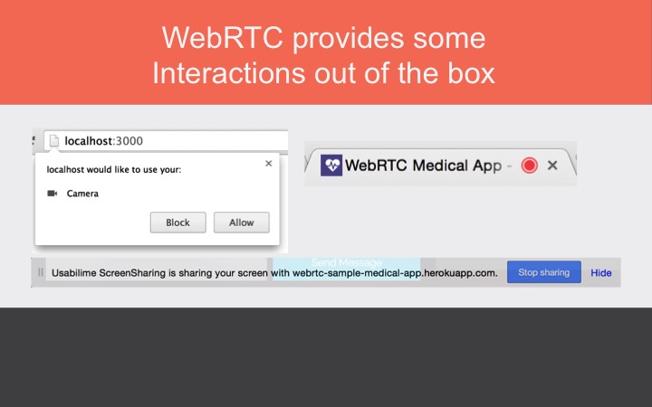
WebRTC provides some interactions right out of the box
Right out of the box, WebRTC provides some visual elements that we cannot control, but are important. However, they are not enough to determine a good user experience.
The allow/disallow buttons for video and audio are controlled by the browser – but what will your app do when someone doesn’t allow you to use their camera?
There’s also that handy “on air” type of icon on the browser tab, to help users know they are live. But users might not notice this, especially when they are under SSL and have previously given you video permissions. So what will your app do to help them remember that they are on camera?
Screen sharing is a very useful feature to build, and has that handy permissions bar at the bottom of the screen that you can’t control, but how will you make the most of screen sharing in your app, especially if combined with video?
UX Terminology
So let’s talk about User Experience and Web RTC. There are a few key UX themes in the following recommendations based on our experience.
Micro interactions are the “spit and polish” of design, the little things users may not notice but make their life better
Information hierarchy refers to the placement and implicit ranking of features in a design. What is most important to users? What do they need immediately available to them?
Feedback in this case is not referring to audio echo or feedback noises, but giving the user feedback about how things are going, and what you might need from them.
Ok, let’s get to details!
Pre-call check
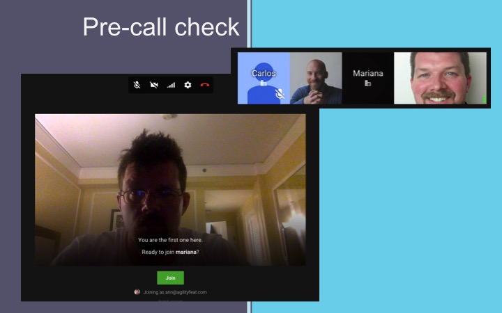
Before the call even starts, there are things that you can do to improve the experience. Hangouts does a nice job of warning you are about to join the call, letting you see the video you will be sharing, and giving you a chance to mute yourself, pause video, or adjust other settings before joining the call. Once you are in hangouts, the UI will give you feedback on the volume of your voice (notice the 3 vertical green dots next to my profile picture when I’m talking) – which is a great reminder once you’re in the call if you’re on mute or not.
To show or not to show your own camera?
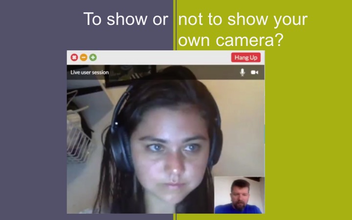
The most common video placement for 1-1 video chat is familiar to us all. In this case, you see yourself in a smaller video – it’s important that users can see how they appear to others. This serves to remind them that they are on camera and should stop picking their nose, and it also helps them to make sure the correct camera is being used and that it’s adjust properly.
However, keep in mind that this Picture in Picture style can be distracting. Ideally you should be able to move your video or hide it in case it’s interfering with the video of the other party.
Subtle audio/video controls for web browsers
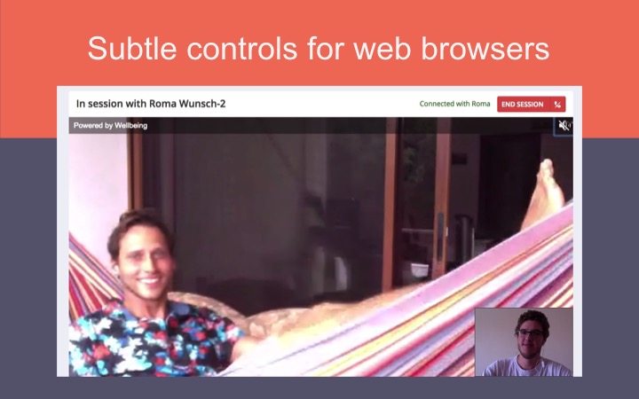
When you’re in a desktop based conversation, the audio and video controls can be subtle. A typical pattern is to put them on top of the video as overlays. Users should be able to find them easily, but the focus should be on the size and quality of the video since this is typically richer for desktop users.
Once you are muted, however, it’s a good idea to make that more obvious to the muted user so they don’t talk to themselves.
Larger controls for mobile apps
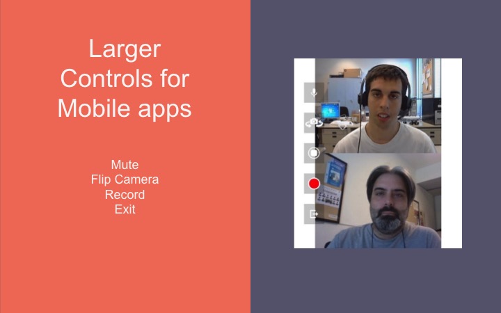
On mobile, remember finger size, and keep the controls prominent, well separated, and easy to touch, overlaid on top of the video.
Screen shot credit:
ViTAM on the iOS Store
Use Overlays Wisely and Temporarily
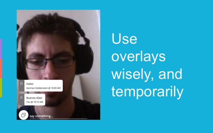
On phones, you don’t have much space to work with. So keep the text chat on the same screen as the video, and overlay it on top. Keep in mind that this will cover up the video as the messages move up the screen, so they should only stay on the page briefly.
Multiparty call video placement
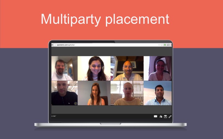
For multi party calls, remember that the dynamics are different. Video pausing may be more important to help performance. Perhaps you want to highlight the dominant speaker with a larger video area. Or perhaps you want all the videos to be the same size, as in this screen shot from a video conference on using OpenTok from TokBox.
Something I think is particularly important is showing a caller’s name or profile picture when their video is paused. If you’ve ever been on a multiparty call where everyone paused their video, it can be hard to tell who is speaking.
Provide Feedback Before and During the Call
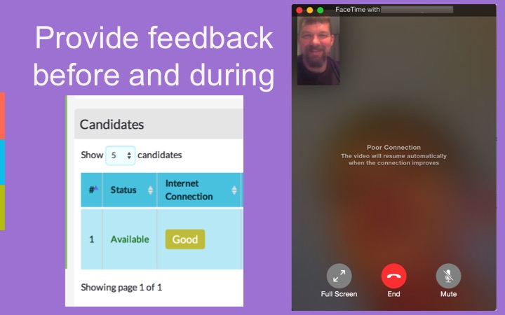
It’s important that you provide feedback to users about the call both before and during the call. If someone’s internet is weak, don’t let people even start a call, or at least warn them about the quality, as we do in this example screenshot from our tool Usabili.me.
During a call, if the connection goes bad, pause video and tell users why, as Facetime does in this example.
Testing the Call Quality
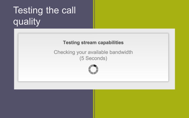
Here is another example of a demo app we built using the Call Quality API of OpenTok. In this case, before the user gets into the call we test their connection, and the video will be disabled by default for the user if the connection strength is not sufficient.
Maintain Focus
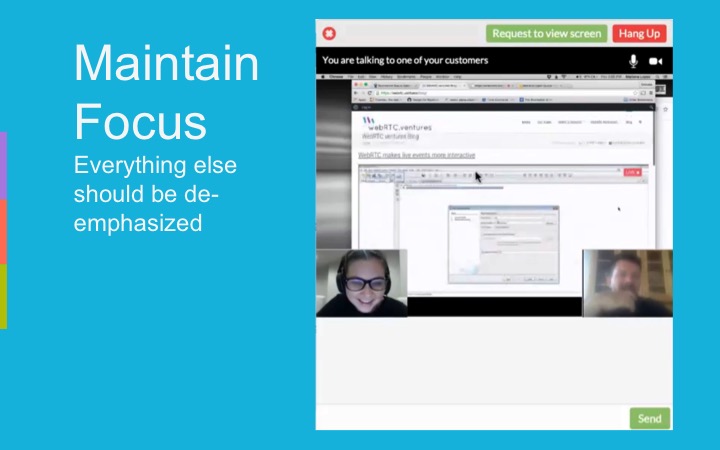
What is the most important thing going on right now? In this example, it’s screen sharing. So the screen share gets the most prominent placement on the page, but all other elements are visible too. However, for a use case like this, we should allow the user to go full screen on the screen share so they can entirely focus on that.
Everything Matters More on Mobile
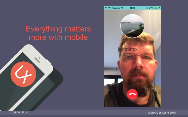
For your mobile applications, make sure you spend some extra time on the UX. Always remember the most important thing to users on the mobile app, and that probably has to do with seeing the video.
In this app GeeVee, it allows me to preview my video while I’m waiting for the other party to connect. It’s using overlays very nicely to show me the profile photo of who I’m calling, give me status on the connection, and allow me to quickly hang up with a standard mobile hangup button, in the place I would normally expect it to be.
Remember that mobile users expect certain patterns like swipes and common button placements.
More than a video tag
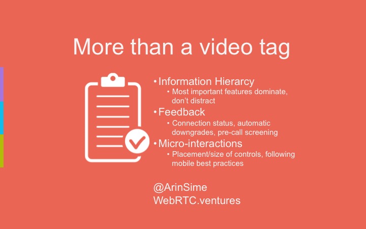
WebRTC is much more than just a video tag thrown on the page. Remember these key points to ensure your users have the best experience possible!
Do you have questions or comments on this presentation or the best way to design your WebRTC web or mobile application? Use the comments section below or contact me directly at arin@webrtc.ventures or on twitter @ArinSime.

